OVER THE MOON CHARITY
Children's Charity
__
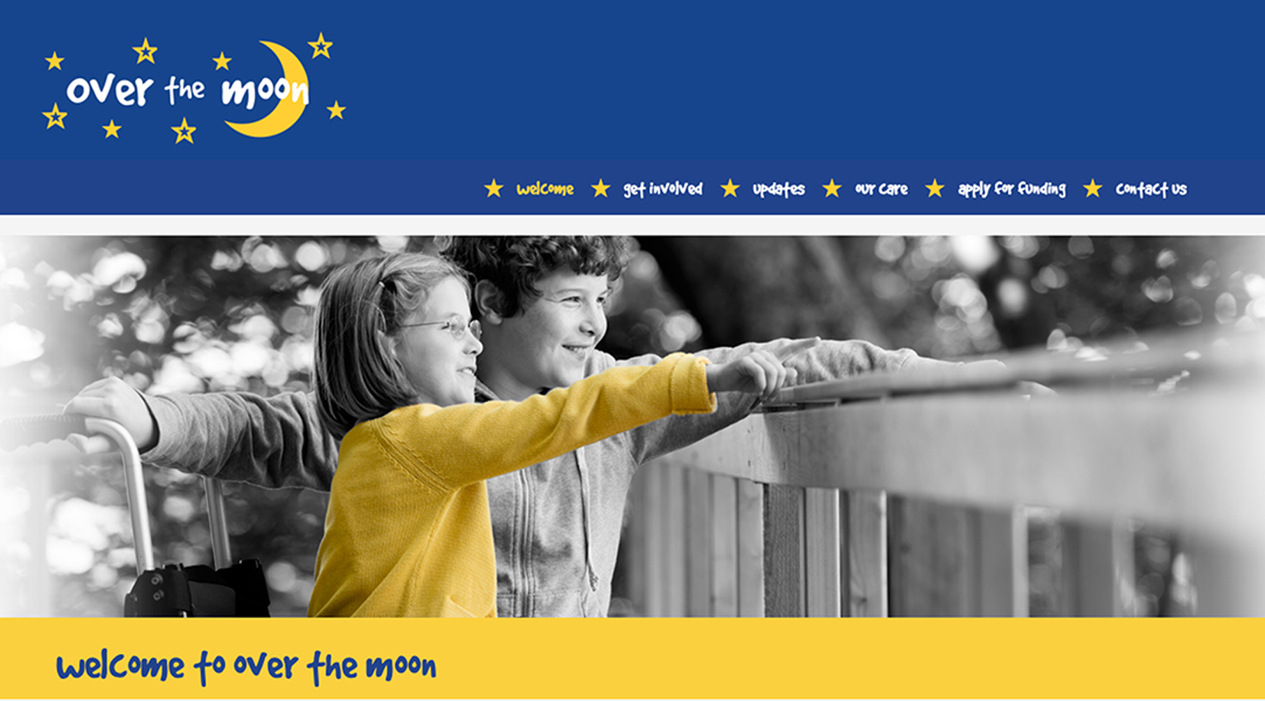
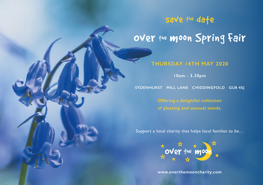
Brand Identity including Stationery, Website Design and Promotional Literature
Over the Moon Charity was set up in 2008 in order to help families of children with disabilities that need their lives enriching through support and extra financial care.
It was important that the identity represented the nature of the charity itself and the children and young adults who it supports, hence the use of vibrant, warm and friendly colours. It epitomises youth and life in terms of yellow, and the blue represents stability.
The logo was a combination of a childlike hand-drawn typeface with naive illustration of the moon and stars to express the story of the Over the Moon Charity and to bring it to a wider audience.


